 |
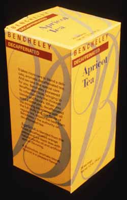
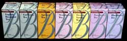
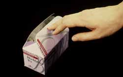
A packaging system intended to position an existing specialty tea on the supermarket shelf, changing from a round tin to a paper box, without alienating an established customer base.The package had to compete favorably with the major brands and emphasize that Bencheley teas are flavored and decaffeinated. In support of the perceived elegance of the product, a classic monogrammed initial B was adapted as brand identification. The script letterform spans the package face wrapping around the single package and across the entire line of packages like a silver ribbon which enhances shelf presentation by creating a billboard effect. Color changes in background and unit name differentiates flavors. Package graphics also read properly horizontally, the orientation in which research shows the user generally stores the product at home. The package is foil-lined with an originally designed reclosable lid to preserve freshness. downloadable pdf |
 |
|
 |